

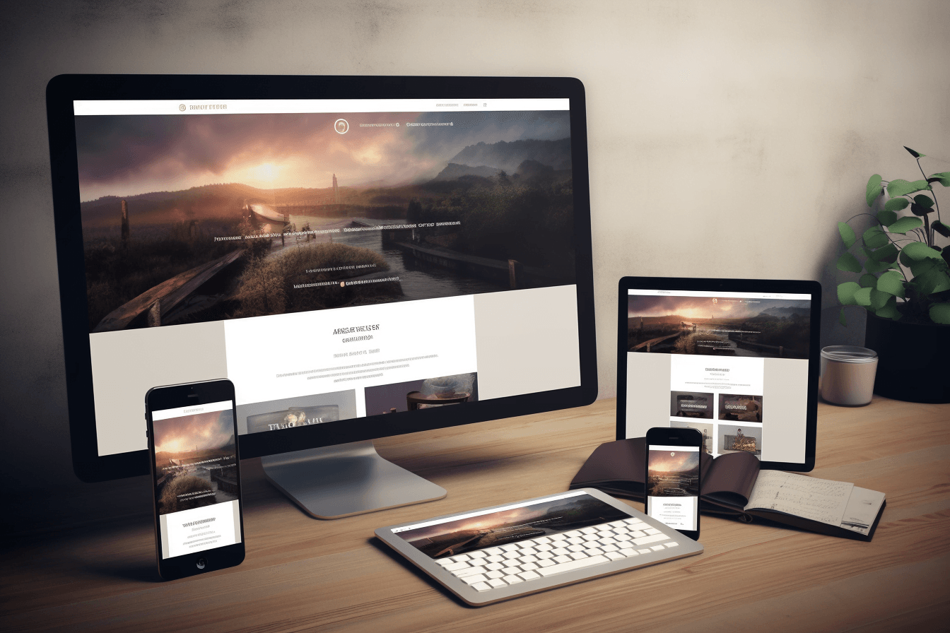
Responsive design is no longer optional. If a website feels awkward on mobile, cramped on tablet, or inconsistent across screen sizes, users notice immediately and trust drops fast.
Good responsive design is not just about making things fit smaller screens. It is about keeping content readable, navigation usable, and interactions clear on every device.
At Peasner Creatives, responsive work usually comes down to one core idea: the layout should adapt without making the experience feel compromised. That means clarity first, then aesthetics.
What is responsive design?
Responsive design is an approach to web design where the layout, typography, images, and interface adapt to different screen sizes and devices. Instead of building separate desktop and mobile websites, you create one system that responds intelligently to the space available.
The goal is simple: a site should remain easy to use whether someone visits from a phone, tablet, laptop, or large desktop screen.
Why responsive design matters
Responsive design affects more than appearance. It has a direct impact on usability, engagement, and conversion.
A responsive website helps because it:
- improves readability on smaller screens
- keeps navigation usable across devices
- supports better loading and performance decisions
- reduces friction during inquiry, checkout, or sign-up flows
- supports stronger search visibility by serving one consistent experience
If visitors have to zoom, hunt for buttons, or fight the layout, they often leave before the content has a chance to work.
The dos of responsive design
1. Do start with mobile-first thinking
Mobile-first design forces you to prioritize what matters most. It helps strip away unnecessary clutter and keeps the structure focused from the beginning. Once the small-screen experience works, expanding it to larger breakpoints becomes more intentional.
2. Do prioritize content hierarchy
Not everything deserves equal emphasis. Your most important message, action, or offer should be obvious at every screen size. Strong hierarchy comes from font size, spacing, contrast, and layout order, not just from adding more design elements.
3. Do use flexible layouts
Grid systems, fluid containers, and flexible widths help content adapt without breaking. A layout should stretch and compress with control, rather than snapping into awkward shapes.
4. Do make typography easy to read
Responsive design is often won or lost in the text. Use readable font sizes, comfortable line spacing, and sensible paragraph width. Headlines can be expressive, but body text must remain easy to scan on mobile.
5. Do optimize images and media
Large media can slow down mobile users and distort layout if handled poorly. Use properly sized images, avoid unnecessary weight, and make sure visuals scale cleanly without pushing key content out of view.
6. Do simplify navigation
Navigation should become clearer on smaller screens, not more confusing. Keep menus concise, make tap targets comfortable, and avoid hiding essential pages under too many layers.
7. Do test across real devices
Browser resizing helps, but it is not enough. Test on actual phones, tablets, and laptops whenever possible. What feels fine in a desktop browser can still be frustrating in someone’s hand.
The don’ts of responsive design
1. Don’t rely on desktop layout patterns everywhere
A layout that works beautifully on a wide screen may collapse badly on mobile. Multi-column sections, side-by-side comparisons, and large navigation patterns need deliberate mobile alternatives.
2. Don’t use fixed widths for key elements
Fixed-width content blocks, images, or tables are common causes of horizontal scrolling and cramped layouts. Responsive elements should adapt to available space without forcing the user to fight the page.
3. Don’t depend on hover for essential actions
Touchscreens do not behave like desktops. If a user must hover to reveal key information, many mobile visitors will miss it entirely. Important content and actions should remain visible or clearly accessible without hover.
4. Don’t overload mobile with heavy visuals
Too many large images, animations, or decorative sections can slow the page and dilute the message. Responsive design is not just scaling down the same experience. It often requires editing the experience for speed and clarity.
5. Don’t sacrifice usability for visual novelty
Interesting interactions can be valuable, but not when they make basic tasks harder. A clean, dependable experience almost always outperforms a clever but awkward one.
Practical responsive design checklist
When reviewing a page, check these essentials:
- Is the main message visible quickly on mobile?
- Are headings and body copy easy to read?
- Are buttons easy to tap?
- Does the layout avoid horizontal scrolling?
- Do images resize without breaking the page?
- Can a user complete the main action without friction?
This kind of review helps catch real UX problems before they become conversion problems.
How responsive design connects to SEO
Responsive design helps SEO indirectly by improving usability, consistency, and engagement. When people can access content easily on any device, they are more likely to stay longer, interact more, and trust the site.
It also supports stronger content performance when paired with clean structure and internal linking. If you are refining content strategy at the same time, this article pairs naturally with our posts on design psychology and portfolio website structure.
Common responsive design mistakes businesses make
- treating mobile as a smaller desktop
- keeping too much content above the fold
- using weak spacing and crowded text blocks
- forgetting form usability on phones
- testing only on one device type
Most of these are fixable once the team starts reviewing the experience from the user’s perspective instead of from the design file alone.
Final takeaway
The best responsive websites do not just resize. They stay clear, readable, and useful across devices.
If you focus on mobile-first thinking, content hierarchy, flexible layouts, readable typography, and realistic testing, responsive design becomes much more than a technical requirement. It becomes part of the overall quality of the brand experience.

