

A strong portfolio website should do three jobs at once: show your best work, explain how you think, and make it easy for the right client or employer to contact you.
That sounds simple, but many portfolio sites miss the mark. They either look attractive but say very little, or they contain too much information with no clear direction. The result is a site that gets visits but does not create enough trust or action.
If you want to create a portfolio website that actually helps you win projects, this guide walks through the process step by step.

What makes a great portfolio website?
A great portfolio website is not just a gallery. It is a focused presentation of your skills, taste, and problem-solving ability.
The best portfolio sites are:
- easy to navigate
- clear about what kind of work the person does
- selective about which projects are shown
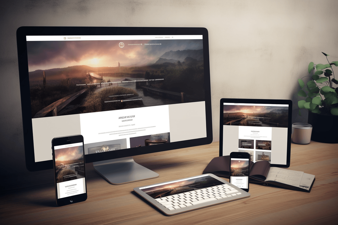
- strong on mobile as well as desktop
- built to guide visitors toward an inquiry, application, or next step
That last point matters. If your portfolio does not create momentum, it may impress people briefly without creating opportunity.
Step 1: Define the purpose of your portfolio website
Before choosing a layout or uploading work, decide what the site needs to achieve.
Ask yourself:
- Do I want freelance clients, a full-time role, or collaborations?
- What kind of projects do I want more of?
- What should a visitor understand about me within the first few seconds?
Your answers will shape the content, tone, and structure of the site. A portfolio for a logo designer should feel different from one built for an interactive media designer or a multidisciplinary agency.
Step 2: Choose the right projects
One of the biggest portfolio mistakes is showing too much work. A stronger approach is to show fewer projects with better context.
A good starting point is 6 to 10 projects. If you are applying for a specific role or pitching a particular client type, trim that even further and prioritize relevance.
Choose projects that show:
- your best visual quality
- different problem-solving situations
- the kind of work you want more of
- some range without becoming unfocused
If you need help deciding how much work to include, this related guide on how big a graphic design portfolio should be is a useful companion.
Step 3: Write a clear homepage introduction
Your homepage should answer three questions quickly:
- Who are you?
- What do you do?
- Why should someone keep looking?
A generic headline like “Welcome to my portfolio” wastes valuable attention. A stronger introduction is specific and outcome-oriented.
For example, instead of saying you are “creative and passionate,” say what you actually help clients achieve through design. Clear positioning creates trust faster than vague enthusiasm.
Step 4: Build project pages that explain the work
Many portfolio sites stop at images. That is not enough, especially if you want higher-value clients or roles where strategic thinking matters.
Each project page should include:
- the client, brand, or project type
- the challenge or objective
- your role
- the design approach
- the final outcome
You do not need long case studies for every piece, but you do need enough context for the visitor to understand why the work is strong.
If the project solved a real problem, say so. That turns a gallery into evidence.
Step 5: Keep the design simple and intentional
Your portfolio website should support the work, not compete with it. Clean structure usually wins.
That means:
- consistent typography
- strong spacing
- easy navigation
- clear calls to action
- fast loading pages
If the design feels too busy, the work can look less confident. Simple does not mean plain. It means every decision has a job.
Step 6: Make the site mobile-friendly
A portfolio website that only looks good on desktop leaves opportunities on the table. Recruiters, clients, and collaborators often discover work on mobile first.
Check that:
- text remains readable on smaller screens
- images resize cleanly
- buttons are easy to tap
- navigation is simple
- the contact path works without friction
Mobile usability is not just a design issue. It affects user trust and search visibility too.
Step 7: Optimize your portfolio website for SEO
If you want your portfolio website to rank on Google, make it easy for search engines to understand the site and easy for people to find the right page.
Start with the basics:
- use a clear page title and heading structure
- write descriptive URLs
- add unique copy to project and service pages
- compress images and use sensible filenames
- link related pages together naturally
A portfolio site with no text, unclear titles, and weak internal links may look good but still struggle to rank.
Step 8: Add proof that builds trust
Trust is a major part of conversion. Someone may like your visuals and still hesitate if the site feels thin or anonymous.
Helpful trust signals include:
- client testimonials
- short case studies
- clear service descriptions
- an about section with real background
- contact details that are easy to find
Even one or two concrete proof points can make a big difference.
Step 9: Make it easy to contact you
Do not hide the next step. If someone likes your work, they should be able to contact you immediately.
Your portfolio should include a visible call to action such as:
- request a quote
- book a call
- email me about a project
- view services
If you offer professional services, connect the portfolio to a stronger service page. On Peasner, for example, a good portfolio flow should support the main services offering rather than feel isolated from it.
Step 10: Keep improving the site over time
A portfolio website is not a one-time task. As your work improves, your site should improve too.
Review it every few months and ask:
- Does this still reflect the work I want?
- Are the strongest projects easy to find?
- Is the copy clear enough?
- Have I added recent work or stronger proof?
Regular small updates keep the site current and relevant.
Common portfolio website mistakes to avoid
- writing vague headlines
- showing too many similar projects
- using weak or low-quality mockups
- ignoring mobile experience
- making the contact process too hard
- publishing projects with no explanation
These are all fixable, and fixing them usually improves both user experience and lead quality.
Final takeaway
To create a killer portfolio website, focus on clarity, strong project selection, thoughtful presentation, and a clear next step. The goal is not to impress everyone. The goal is to connect quickly with the right audience and give them confidence in your work.
If you want examples of more conversion-focused creative presentation, you can also review our case studies and explore related thinking on design psychology.

