
Designing a shirt starts with one question: what should the shirt do? A good shirt design might promote a brand, unify an event team, celebrate a campaign, or simply look good enough that people actually want to wear it again. When the purpose is clear, the design decisions become easier.
That is why strong shirt design is usually less about decoration and more about clarity. The best designs fit the audience, the printing method, and the message without trying to force too many ideas into one small surface.

Start with the purpose of the shirt
Before choosing colors or graphics, define the role of the shirt. A church event shirt, company uniform, campaign giveaway, merch piece, and fashion tee all need different design choices.
Ask a few simple questions first:
- Who will wear the shirt?
- Where will people wear it?
- What should they notice first?
- Is the shirt meant to inform, promote, or simply look stylish?
These answers shape everything from layout to color to the amount of text you should use.
Choose the print method early
Many shirt designs go wrong because the idea is created first and the production method is considered too late. Screen printing, heat transfer, DTF, embroidery, and sublimation all behave differently. A design that looks exciting on a laptop may become expensive, muddy, or hard to reproduce on fabric.
For example, screen printing usually rewards simpler color decisions and bolder shapes. Detailed photo-heavy artwork may need a different production route. If you know how the shirt will be produced, you can design more intelligently from the start.
Build the concept around one strong idea
The most effective shirt designs usually have one main idea, not five. That idea could be a slogan, a symbol, an illustration, a logo lockup, or a visual theme. Once you know the core idea, everything else should support it.
If the design is for a brand, keep the visual language consistent with the rest of the identity. If the design is for an event or campaign, focus on recognizability and energy rather than trying to tell the whole story on the shirt.
Keep the layout readable from a distance
Shirts are viewed quickly and often from several feet away. That means readability matters more than tiny flourishes. A smart layout usually depends on:
- clear hierarchy between the main message and supporting details
- font sizes that remain readable when printed
- enough spacing around text and graphics
- a focal point that stands out immediately
If someone has to stare too long to understand the design, it probably needs simplification.
Use color with the fabric in mind
Shirt color is part of the design, not just the background. A graphic that works beautifully on white may disappear on black or compete badly with a bright fabric color. Good shirt designers think about contrast early.
When in doubt, use a tighter palette and make sure the most important element has enough separation from the shirt itself. Bold contrast often prints better and reads faster.
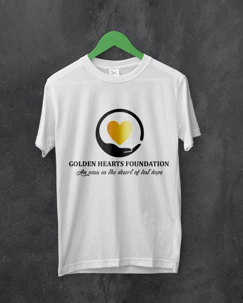
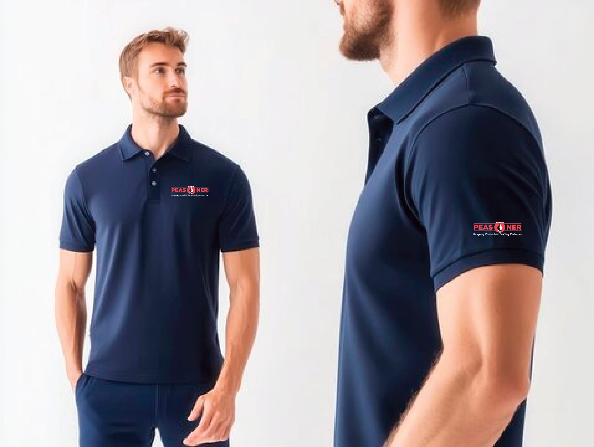
Match the design to where it will sit on the shirt
Placement changes how a design feels. A centered front graphic feels different from a left-chest logo, back print, sleeve detail, or oversized streetwear layout. Think about whether the shirt is supposed to feel formal, promotional, playful, or fashion-led.
Common placement options include:
- front center for the main message or artwork
- left chest for cleaner branded applications
- back print for large event, campaign, or merch statements
- sleeves for secondary details such as dates, handles, or small marks
Prepare a clean production file
Once the concept is working, the artwork needs to be prepared properly. Vector files are usually best for logos, text, and simple illustrations because they stay sharp at different sizes. Raster artwork can work too, but it needs enough resolution for print.
Before sending artwork for production, double-check:
- text spelling and alignment
- color choices and contrast
- transparent background where needed
- correct dimensions for the print area
- file format requested by the printer
Common shirt design mistakes to avoid
Some problems show up again and again in weak shirt designs:
- too much text competing for attention
- artwork that is overly detailed for the print method
- poor contrast between ink and fabric color
- trying to fit multiple ideas into one front graphic
- using trendy effects that do not reproduce well on fabric
Most of these mistakes come from skipping the planning stage rather than lacking creativity.
When it helps to work with a designer
If the shirt is part of a launch, campaign, school event, company teamwear set, or branded merchandise line, getting professional design support can save time and improve the final result. A designer can help turn rough ideas into something that prints well, feels intentional, and fits the wider brand system.
That is also where broader design thinking matters. Strong apparel design often benefits from the same clarity discussed in why businesses still need a graphic designer and the practical communication principles behind the psychology of design.
How Peasner approaches shirt design
At Peasner, shirt design works best when it is treated as both a branding surface and a real-world product. The design has to communicate quickly, print reliably, and feel good enough that people actually wear it. That balance matters more than piling on effects.
Final takeaway
To design a shirt well, start with the purpose, keep the idea focused, design for the printing method, and make readability a priority. The best shirt designs are usually the ones that look clear, wearable, and intentional from the first glance.

